A dark VS Code color theme built for reading code in an era where agents write it.
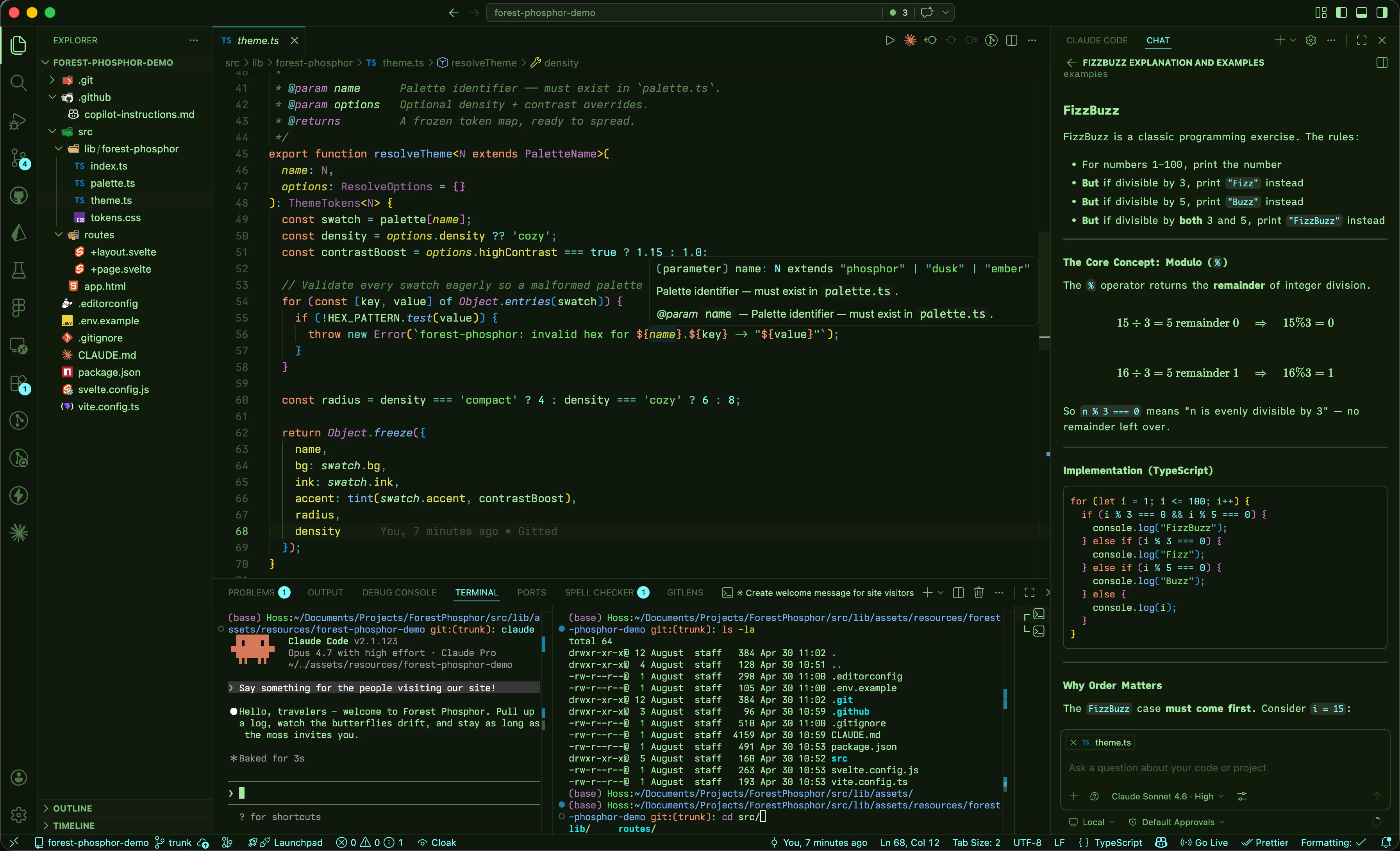
When your agent opens a 400-line PR, you're not writing — you're auditing. When you're reviewing generated logic for correctness, onboarding to an unfamiliar codebase, or scanning a diff at the end of the day, the bottleneck isn't how fast you can type. It's how fast you can read. Forest Phosphor is built around that reality.
Enough contrast to read clearly, enough separation between roles to parse at a glance, and enough restraint to work in low-light or bright conditions over long sessions. It's built around what tokens do, not what category they belong to.
Cyan is a variable, Blue is a property, Yellow is callable. Purple is a concrete shape - class, struct, enum - and Pink is an abstract one: interface, type, generic. Amber marks structure: function, class, return, import. Mint is the semantics, Italic Mint is a parameter, and Dim Mint is for comments. Brighter Green is for strings, White is for numbers, floats, booleans, or literals like undefined, null, nil, NaN, and Coral is for attention: this, throw, unsafe, errors. After a few hours, your eye stops reading individual tokens and starts reading the shape of the code.
The aesthetic borrows from old phosphor CRT monitors: mint prose on forest-green, low-contrast backgrounds for long sessions, and saturated phosphorescent accents used sparingly. Part of the Forest Phosphor family - a coordinated palette across VSCode, Obsidian, and iTerm2.
Design philosophy
Most themes were designed for writing code - you knew what you were about to type, so token categories were enough. Reading someone else's code (or your agent's code) is different. You need to extract intent fast, from an unfamiliar structure, under real cognitive load.
Conventional themes assign color by token type - keyword gets one color, identifier gets another, and the visual hierarchy ends up tracking the grammar instead of the meaning. Forest Phosphor assigns color by semantic role: what a token does in the code. The grammar is incidental; the role is what you're actually reading for.
The palette is built around three tiers of visual weight.
Tier 1 - Foreground green 
#A2EBA1
The language itself, and the structural scaffolding around your code.
This covers more than most themes give it. Flow keywords like if, else, for, while, &&, =, {}, ; get foreground green - they're the grammar of every line and shouldn't shout. But foreground also covers parameters in function signatures (rendered italic to distinguish them from keywords), and the operators and punctuation that hold expressions together.
The reasoning: an if isn't an action, it's a structural marker telling you what kind of branch you're reading. A parameter like id in function fetchUser(id, options) isn't being called or declared in the way the function name is - it's a label for an incoming value. These tokens are part of the semantic and contextual structure of the file. They're meant to be read, the way you read the words "the" and "and" in prose. They earn their place by being legible, not by drawing your eye.
The italic on parameters is doing real work here: it lets parameters share the foreground role (read with the language) while still being distinguishable from keywords. Style as a fourth dimension beyond hue.
Tier 2 - Amber 
#E8A030
Structural declarations. Medium frequency. These are the tokens that mark architectural decisions: where a function begins, what gets imported, where control flows back. function, class, return, import, async, await, new, yield. HTML tags share this color - they're the structure of a page the way function is the structure of a module.
When you scan a file looking for "where does the auth logic start?" - amber is what your eye lands on.
Tier 3 - Coral 
#EA9575
Attention signals. Used sparingly on purpose. When you see coral, something demands focus: this, self, super, throw, break, continue, unsafe. Errors and invalid tokens get coral too. Coral interrupts your scan.
If coral were common, it would lose meaning. The tier system depends on this one being rare.
The object system - a blue gradient
Three colors describe the lifecycle of any object reference: what is it, what's on it, what does it do?
| Color | Role | Examples |
|---|---|---|
 Cyan #7AF8FF |
Variables - what is this thing? | userId, response, items |
 Blue #77B0FF |
Properties and fields - what's on it? | .displayName, .length, object keys |
 Yellow #D1CF32 |
Functions and methods - what does it do? | fetchUser(), .map(), groupBy() |
Reading user.profile.fetch() becomes a sentence: cyan thing → blue attribute → yellow action.
The type system - a purple gradient
Two colors split the difference between types you instantiate and types you describe.
| Color | Role | Examples |
|---|---|---|
 Purple #C07AC8 |
Concrete shapes - things you instantiate | class UserService, enum Direction, decorators |
 Pink #FFB4E2 |
Abstract shapes - contracts and descriptions | interface User, type ApiResponse, <T>, string, number |
If you can new it, it's purple. If you write a contract for it, it's pink. Primitives like string and number are pink because they describe what something must be, not a thing you construct.
Literal values
Near-white 
#E8F0E8 is reserved for values that are the data - numbers (42, 3.14), booleans (true, false), null, undefined. Also used for structural delimiters that sit outside normal expression flow: Rust lifetimes ('a), template/interpolation braces (${}), Svelte's reactive $:, labels.
Strings
Strings get their own bright green 
#73e165 - close to the foreground hue but saturated and brighter. They sit in the same family as prose but are clearly distinguished as quoted content.
Comments
Comments are 
#5C8656 - a muted, mid-forest green rendered in italic. They recede into the background without disappearing entirely. JSDoc/TSDoc tags get a slightly brighter 
#7CBF78 so doc-comment metadata stays scannable.
Reference: nesting depth rotation
Bracket pair colorization and JSON/object key colors follow the same depth rotation, so closing brackets and their corresponding key always share a color:
| Depth | Swatch | Color |
|---|---|---|
| 1 | |
Blue #77B0FF |
| 2 | |
Yellow #D1CF32 |
| 3 | |
Pink #FFB4E2 |
| 4 | |
Purple #C07AC8 |
| 5 | |
Cyan #7AF8FF |
| 6 | |
Near-white #E8F0E8 |
Brackets start at near-white at the outermost scope and work inward (white → blue → yellow → pink → purple → cyan), so the outermost level is always the most neutral and deeper nesting gets warmer.
Language coverage
Verified most thoroughly for TypeScript / JavaScript / JSX / TSX - that's where most of the fine-tuning has happened. The rest is covered with hand-tuned scope rules:
- Svelte - template blocks (
{#if},{#each}), directives, component tags, reactive declarations ($:) - Python -
self/cls(coral), decorators (purple), f-string interpolation, kwargs (blue), typing builtins (Optional,Union- pink), magic methods - Rust - lifetimes (white), traits (pink), structs/enums (purple), macros (cyan),
unsafe(coral), attributes/derives (purple), primitive types (pink) - HTML / CSS / Markdown - tags (amber), attributes (blue), pseudo-classes (pink), at-rules (amber), CSS class/ID selectors (yellow)
- JSON / YAML / TOML - depth-aware key coloring
- Shell / Bash - variables (cyan), builtins (amber), functions (yellow)
- GraphQL - types (pink), fields (blue)
- Go, C/C++, C#, Java - structural keywords and type distinctions
If you find a token in any language that doesn't read right, that's a real bug - open an issue.
Palette reference
| Swatch | Hex | Role |
|---|---|---|
 |
#A2EBA1 |
Foreground - flow keywords, operators, punctuation, parameters |
 |
#73e165 |
Strings |
 |
#7AF8FF |
Variables, macros, enum members |
 |
#77B0FF |
Properties, fields, object keys |
 |
#D1CF32 |
Functions and methods |
 |
#C07AC8 |
Classes, enums, structs, decorators |
 |
#FFB4E2 |
Interfaces, type aliases, generics, primitives |
 |
#E8A030 |
Structural keywords - function, class, return, import |
 |
#EA9575 |
Attention - this, throw, unsafe, errors |
 |
#E8F0E8 |
Literal values - numbers, booleans, null |
 |
#5C8656 |
Comments |
 |
#5AE66A |
Git additions, terminal green, test pass |
 |
#D4A24A |
Warnings, git modifications |
Install
- Open Extensions in VS Code (
Ctrl+Shift+X/Cmd+Shift+X) - Search for Forest Phosphor
- Click Install
- Open the Command Palette (
Ctrl+Shift+P/Cmd+Shift+P) and select Preferences: Color Theme - Choose Forest Phosphor
Screenshots
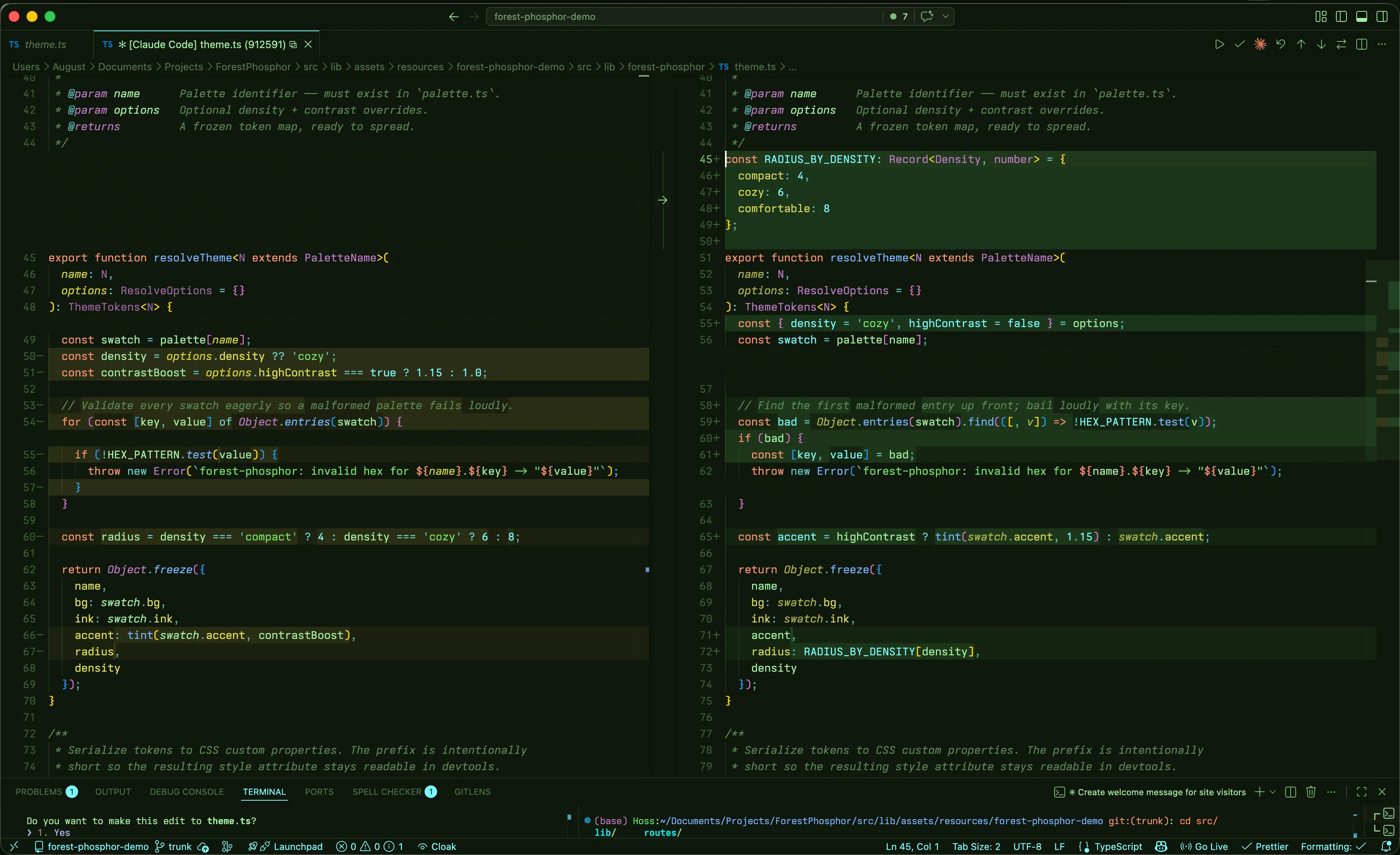
Diff view
Forest Phosphor's git colors share the same role logic as the syntax palette - additions in saturated phosphor green, modifications in warm amber, deletions in coral.
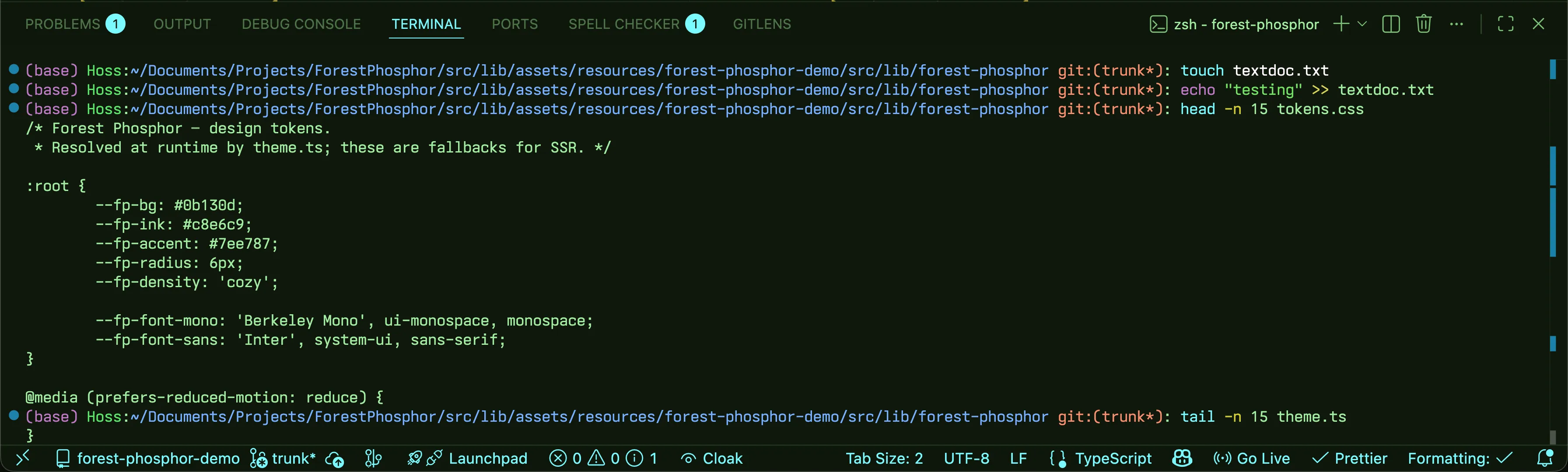
Integrated terminal
The terminal screenshot pairs Forest Phosphor with the matching iTerm2 preset. Grab it at forestphosphor.dev.
Family
- VSCode - this theme
- Obsidian - forest-phosphor-obsidian
- iTerm2 - forest-phosphor-iterm2
All three share the same hex values; switch between apps without losing the look.
Reporting issues
If you find an unstyled element or a token that doesn't read right, open an issue with a screenshot and the language being highlighted. Themes have long tails - user reports are how the gaps get found.
About
Built by Steven Theuerl (@Steven-Theuerl). The full design system lives at forestphosphor.dev.
License
MIT - see LICENSE.