Plot and inspect NumPy arrays, Pandas DataFrames and tensors while you are stopped in the debugger. Type an expression, see the data.
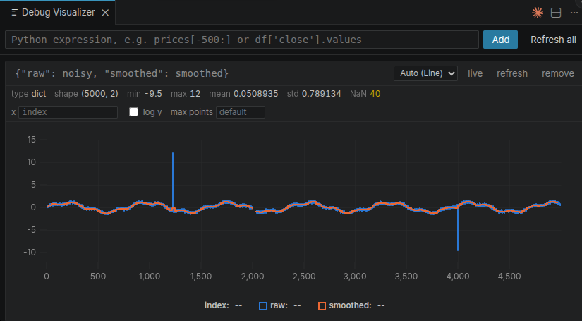
Two arrays from one expression. The gap at x ≈ 2000 is real — 40 NaN, and the
statistics say so. The spikes at 1234 and 3999 are single samples the plot is
far too coarse to draw, which is exactly why min and max are there.
Why
VS Code can already show you a DataFrame as a table, and it can show you an image. What it cannot do is answer the question you actually have at a breakpoint: did this array change the way I expected?
This is built for stepping through an algorithm — plotting the same expression at successive steps, overlaying them, and seeing what moved.
Getting started
- Start a Python debug session and pause it.
- Run Python Debug Plots: Open Plots from the Command Palette.
- Type an expression —
prices[-500:],df["close"].values,weights.
You can also select an expression in the editor and press Ctrl+Alt+V
(Cmd+Alt+V on macOS), or right-click a variable in the Variables view and
choose Plot.
Expressions are re-evaluated every time the debugger stops, so stepping through a loop animates the plot. Freeze a pane to hold it still for comparison.
Plotting several things together
Each expression is one pane, so combining values means making the expression produce them. A plain dict needs no library at all:
{"raw": noisy, "smoothed": smoothed}   # a dict
prices[["close", "sma20"]]             # DataFrame columns
np.column_stack([signal, smoothed])    # a narrow array
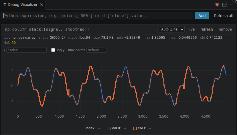
Six views, chosen per pane
The dropdown offers whatever suits the value. Auto follows what the runtime suggests after looking at it.
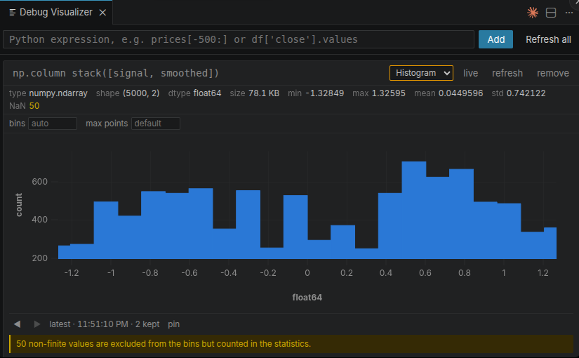
Binning happens inside the debuggee, so five million points become sixty bars before anything crosses the wire. The bars sum to less than the element count, and rather than leave you to notice that, the pane says why.
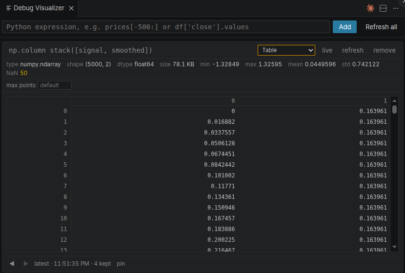
A million cells would be a million DOM nodes, so only the visible rows exist.
Pandas, with real dates
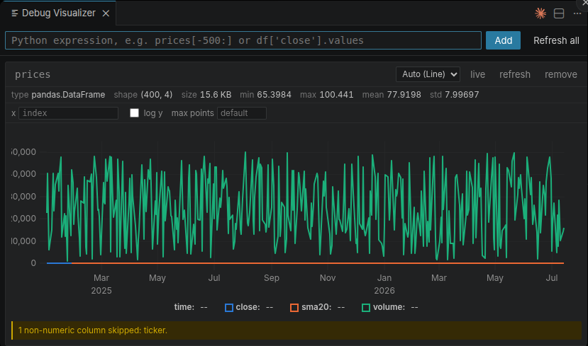
Every numeric column becomes a line on a shared time axis. The text column is reported rather than dropped — a column vanishing without a word is indistinguishable from a bug in your own code.
This picture also shows a trap worth knowing: volume runs to 50 000 while
close sits near 100, so one scale flattens the other two. Plot
prices[["close", "sma20"]] when the units differ.
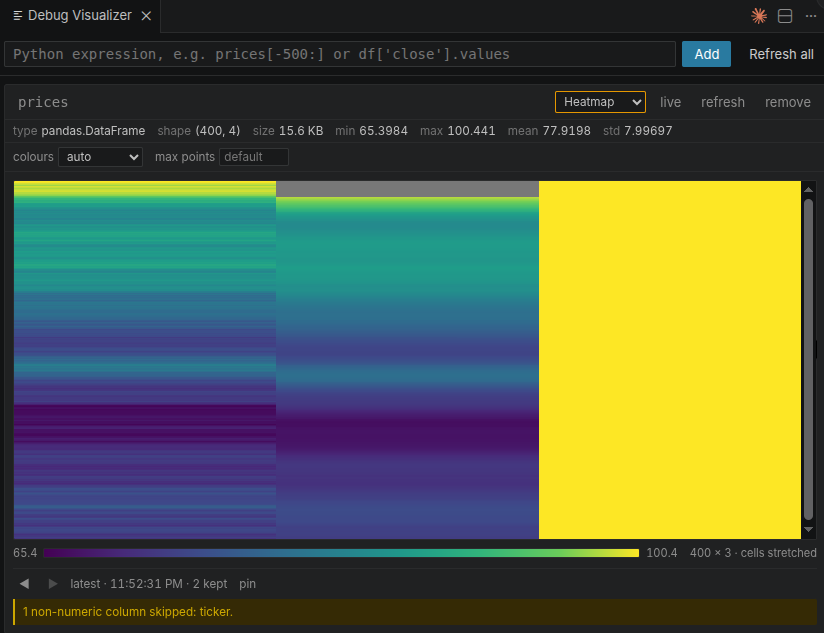
The same data as a colour matrix, with its scale — and a note that the cells were stretched to fit, because a stretched cell misrepresents the proportions of what is in it.
What else it does
- Statistics you can trust — shape, dtype, min/max/mean/std and NaN/Inf counts, always computed over the whole value, even when the plot is downsampled or zoomed.
- Step back and compare — each pane keeps its recent captures. Scrub through them, pin one, and later steps are drawn against it as a dashed line with a count of how many points actually moved.
- Zoom that adds detail — drag a range and the runtime re-captures inside it, spending the whole point budget on what you are looking at.
- Any expression as the x axis, so you can plot one quantity against another.
- Honest downsampling — when a series contains NaN, downsampling switches to a method that keeps the gaps visible instead of quietly closing them.
Works with NumPy arrays, Pandas DataFrames, Series and indexes, PyTorch and TensorFlow tensors, dicts of arrays, and plain lists. Anything else is described — type, shape and repr — rather than refused.
Tensors are handled properly rather than nominally: one with requires_grad is
readable, a CUDA tensor is copied without disturbing the program, bfloat16
widens instead of failing, and a sparse tensor is described rather than silently
densified into memory you may not have.
No installation in your project
The Python side is injected into the debug session at runtime. There is nothing
to pip install, so it works in virtualenvs, Docker containers, dev containers
and over Remote-SSH without touching your environment or leaving anything on
disk.
Settings
| Setting | Default | |
|---|---|---|
pythonDebugPlots.maxPoints |
20000 | Points transferred per series before downsampling. Statistics ignore this. |
pythonDebugPlots.autoRefresh |
true | Re-evaluate expressions each time the debugger stops. |
pythonDebugPlots.historyDepth |
20 | Past captures kept per expression. |
Bin count, point budget, log scales, colormap and the x axis are set per pane, in the row under its header — they belong to one question rather than to the whole workspace.
Requirements
VS Code 1.89 or newer, and a Python debug session using debugpy — the debugger
that ships with the official Python extension.
Status
First release. Everything above works and is covered by tests, including runs against a real debugpy session.
Two things are honest gaps rather than oversights. It has not been run against a real Remote-SSH or dev-container setup: the design is built for them and the reasoning is written down, but reasoning is not a measurement. And scatter takes one series against the x axis rather than several x/y pairs.
Reports from remote setups are especially welcome on GitHub.
License
MIT